5-Card Friday
A Bi-Weekly Update from the ITS UX Team

9 Commonly Misused UX Design Terms
The author of this article asked a few experts to cite frequently misused design terms that might be worth clarifying.
Flip the card over to learn more.
Commonly Misused UX Design Terms
At the top of the list of commonly misused UX design terms is the UX word itself: User experience. Being a UX designer, I can see how it might be confusing to others to say that you design "experiences"... what does that actually mean? Isn't everything an "experience"?
Here is the list of 9 commonly misused UX design terms:
- User experience
- User testing
- Customer experience
- Consistency
- Frictionless and seamless
- Navigation
- Disruption
- Inclusive design
- Participatory design
Do you have any other words to add to the list?
Read Full Article
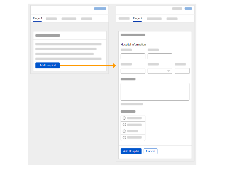
Should you fix a design error in the middle of user testing?
with iterative design testing, it’s often more important to capture as much data as possible, even if that means changing things mid-test.
Learn more on the back of this card.
Fixing Design Errors During User Testing
There are good arguments for and against changing prototypes. One of the primary arguments for changing a prototype is we're not running a strict quantitative test. As a result, not all test conditions have to be the same.
Users will see your prototype for the first time only once. So, devoting their mental energy towards gathering those insights, problems, and alternatives is an excellent use of their time.
You shouldn't be afraid to change something mid-test, especially if it allows you to get to what you want to learn.
Read Full Article
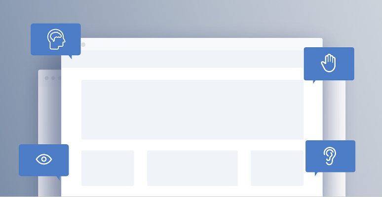
Accessibility for Ecommerce: 3 Best Practices For Navigational Links (73% of Sites Fail)
The vast majority of ecommerce sites are failing their users when it comes to link accessibility.
Flip the card over to learn more.
Links & Accessibility
Some sites lack HTML markup that is accessible to screen readers.
And, a majority of sites lack sufficient information regarding link destination and purpose for users with screen readers—resulting in a trial-and-error navigational method.
Further, some sites have insufficient link contrast with surrounding text — making it hard for users with visual impairments and scanning users to locate links.
In this article, the author discusses 3 key methods for making links accessible to all users:
- Identify links to screen readers using accessible markup (9% of sites don’t).
- Include sufficient contextual information to convey the purpose or destination of a link (67% of sites don’t).
- Use visually distinctive link styling (9% of sites don’t).
Read Full Article
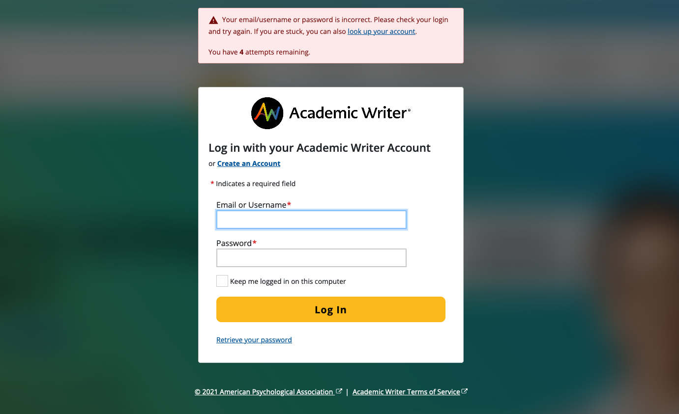
New Academic Writer/IDEM Screens
For the Academic Writer direct-to-student initiative, a vendor is building a new marketing site in Wordpress. This site will also manage the subscription and payment process.
The IUX Team designed new IDEM screens (e.g., login, create account, retrieve password) to be used with this new site, which are based off of the IUX Team's Pattern Library CSS along with the newest Bootstrap 5 CSS.
Flip the card over to learn more.
New ACW–IDEM Screens
During student sign-up or login, users will be passed back to the IDEM system for account creation. Since there will be a back-and-forth from the marketing site to the IDEM screens, the experience needed to appear seamless to the user and have comparable UX throughout.
The IUX Team took this project as an opportunity to use our Pattern Library's stylesheet on these screens, as the previous IDEM screens use Bootstrap 3 and predates our Pattern Library and the stylesheet it generates.
Also, these are the first screens we have made that is using Bootstrap 5 as the core CSS library (all other apps are using Bootstrap 4). In the upcoming year, we plan to review all of our Pattern Library components to make sure they work well with Bootstrap 5.
View the Mockups
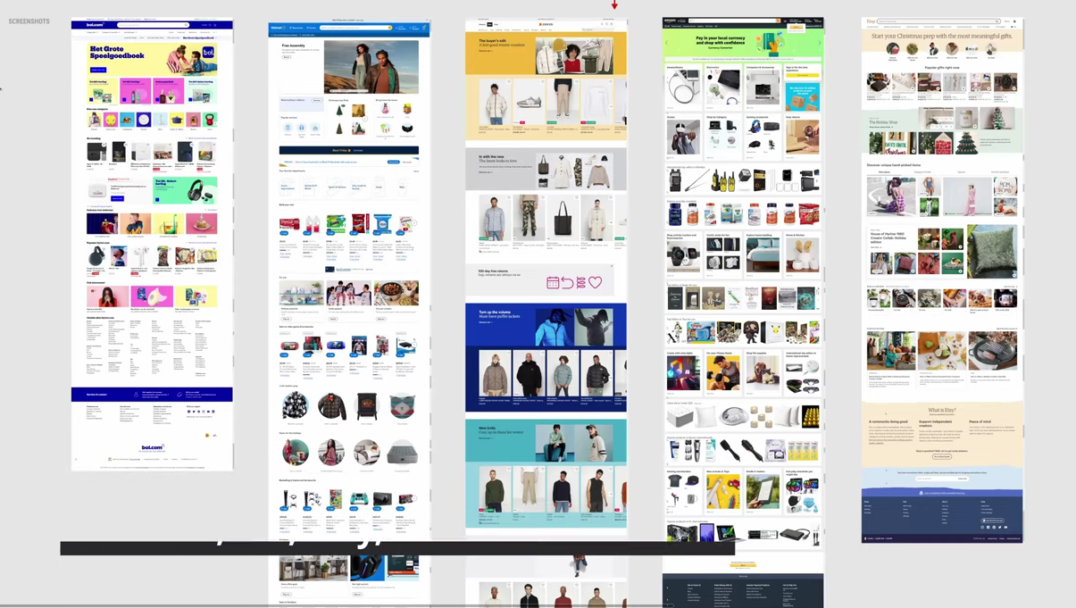
Amazon's, Bol's, Etsy's, Walmart's, and Zalando's Ecommerce Homepages
The A/B testing and optimization site, GoodUI, reviewed the homepage layouts of five ecommerce leaders.
Learn more and view the YouTube video on the back of this card.
Ecommerce Homepages
Most ecommerce homepages contain a mix of product categories, top selling products and special deals.
These sites regularly conduct A/B testing on these designs as well, as even the slightest changes to these pages (e.g., changing a "Buy Now" button to "Add to Cart") could result in much different revenue and a different user experience.
View the YouTube video to learn more about the different ecommerce homepages from Amazon, Bol, Etsy, Walmart, and Zalando.