5-Card Friday
A Bi-Weekly Update from the ITS UX Team
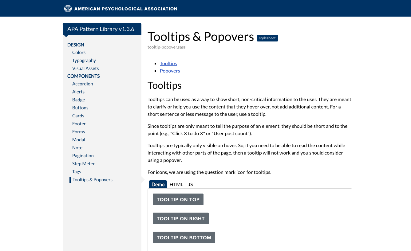
Pattern Library Update: Tooltips and Popovers
The ITS UX team has a new pattern library update! In this update we have refined the tooltip section and also added popovers. Tooltips and Popovers are helpful in providing useful tips for users in a discreet way. Within the pattern library, you will find examples and usage guides for each one.
Flip the card over to learn more.
What's the Difference Between Tooltips and Popovers?
Tooltips are meant for short bit sized information. Popovers on the other hand are meant to be more verbose and can include a header, links, lists and HTML. The behavior of each is different as well. Tooltips display only on hover, whereas Popovers can display on hover and on click.
If you are curious to learn more about usages for each one, check out the pattern library to learn more!
Go to Pattern Library
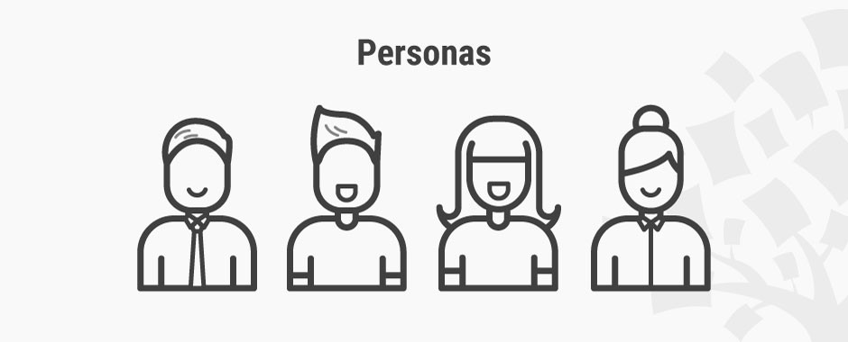
Personas – A Simple Introduction
Personas are fictional characters, which you create based upon your research in order to represent the different user types that might use your service, product, site, or brand in a similar way.
Creating personas will help you to understand your users’ needs, experiences, behaviours and goals.
Flip the card over to learn more.
Personas
Creating personas can help you step out of yourself. It can help you to recognise that different people have different needs and expectations, and it can also help you to identify with the user you’re designing for.
Personas make the design task at hand less complex, they guide your ideation processes, and they can help you to achieve the goal of creating a good user experience for your target user group.
Read Full Article
How to Use Empathy to Design for Inclusion
If you think of accessible and inclusive design, things like placeholder text color considerations and correct content markups spring to mind — and they should. But visual and hearing accommodations are just the beginning of creating an inclusive web.
Often, those with intellectual, developmental, or learning disabilities have a less-than ideal web experience because their needs fit on a spectrum, and can’t be solved with a universal solution.
Flip the card over to learn more.
How to Use Empathy to Design for Inclusion
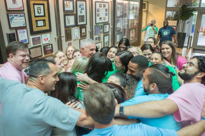
For years, the Dan Marino Foundation has a long and distinguished mission of empowering individuals with autism and other developmental disabilities through life-changing programs and services.
The article discusses three inclusion lessons the team learned from their project.
Read Full Article
Designing a Healthy Society
As researchers and designers of emerging technologies, we need to reflect and ask ourselves, what’s within our power to help realize a future that invites participation from the full spectrum of human diversity.
Flip the card over to learn more.
Designing a Healthy Society
There’s no doubt that every product team wants to create products or systems that work well for everyone. The reality is there’s often a wide gulf between that desire and the outcome. Too often our products don’t work equally well across diverse groups or they don’t treat everyone fairly.
One such recent shortcoming was illustrated by object-recognition algorithms from several popular cloud services. Using a global dataset, these services made 10 percent more errors when identifying common items, such as hand soap (i.e., a soap bar versus a soap dispenser), in lower-income households. Furthermore, they identified items in US households with 15 to 20 percent greater accuracy than those in Somalia and Burkina Faso. Assumptions abound.
Read Full Article
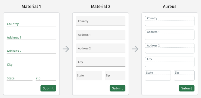
Form Inputs Redesigned
Material Design is a popular and well used design language that Google developed in 2014. It has been a very useful library for designers and developers to refer to and use. Over the years, there has been some discussion around the usability of this design system and how it can be improved upon.
Flip the card over to learn how one team approached making the forms more usable.
Form Inputs Redesigned
In order to hit the ground running with a solid, well-documented and well-supported design pattern, the team opted to move full steam ahead with the Material Design aesthetic. In a lot of cases, Material does really well to provide guidelines (and many 3rd party design systems and templates) to create simple, clean interfaces without too much additional thought or decision-making needed.
After some time, the team started to find more and more situations where users became confused about field states and their interactivity.
Read Full Article