5-Card Friday
A Bi-Weekly Update from the ITS UX Team
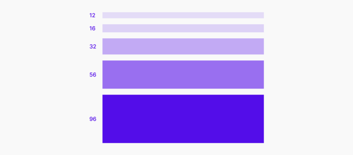
Applying White Space in UI Design
8 practical tips, with examples.
Flip the card over to learn more.
Applying White Space in UI Design
Good UI design is the thoughtful application of white space at all scales of an interface, from component to page, micro to macro. When white space is used well, the result is an interface that is harmonious, legible, and, above all, effective and easy to use.
Read Full Article

The ADA Checklist: Website Compliance Guidelines for 2021 in Plain English
What does ADA compliant mean for websites?
Your website provides full and equal access, effective communication, and/or meaningful access. In terms of preventing litigation, WCAG 2.1 AA conformance is best practice.
Flip the card over to learn more.
The ADA Checklist: Website Compliance Guidelines for 2021 in Plain English
The law that primarily governs accessibility in the U.S. is the Americans with Disabilities Act (ADA).
The gist of the ADA is if you don’t make things accessible, then you’re discriminating against those with disabilities.
Read Full Article

How to Do A/B Testing
Planning to run an A/B test? Bookmark this checklist for what to do before, during, and after to get the best results.
Flip the card over to learn more.
How to Do A/B Testing
When marketers like us create landing pages, write email copy, or design call-to-action buttons, it can be tempting to use our intuition to predict what will make people click and convert.
But basing marketing decisions off of a "feeling" can be pretty detrimental to results. Rather than relying on guesses or assumptions to make these decisions, you're much better off running an A/B test — sometimes called a split test.
Read Full Article
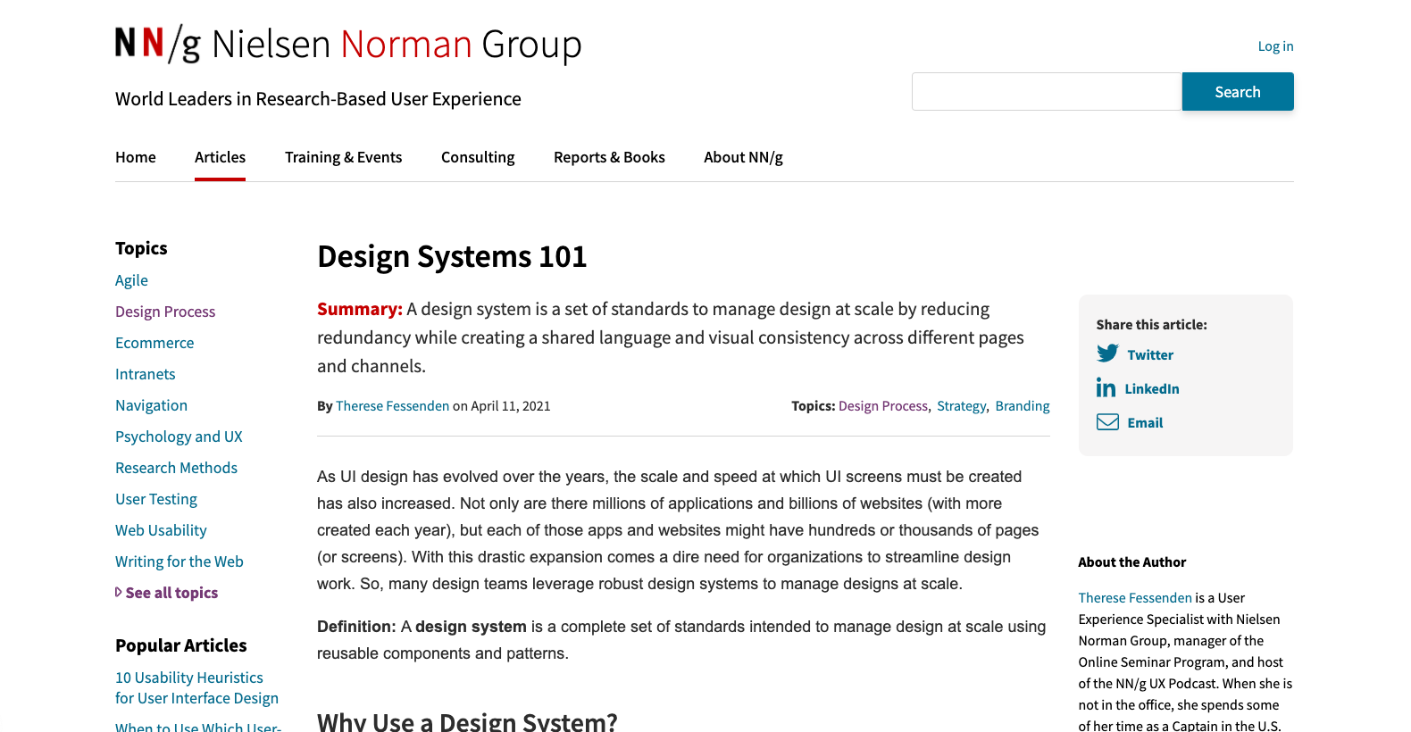
Design Systems 101
A design system is a set of standards to manage design at scale by reducing redundancy while creating a shared language and visual consistency across different pages and channels.
Flip the card over to learn more.
Design Systems 101
As UI design has evolved over the years, the scale and speed at which UI screens must be created has also increased. Not only are there millions of applications and billions of websites (with more created each year), but each of those apps and websites might have hundreds or thousands of pages (or screens). With this drastic expansion comes a dire need for organizations to streamline design work. So, many design teams leverage robust design systems to manage designs at scale.
Read Full Article
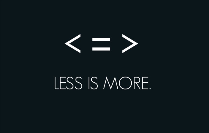
To Add is Expected, to Subtract is Design
A couple years ago I wrote about how healthcare should take customer experience guru Dan Gingiss’s advice: do simple better. Now new research illustrates why this is so hard: when it comes to trying to make improvements, people would rather add than subtract.
Flip the card over to learn more.
To Add is Expected, to Subtract is Design
Additive ideas come to mind quickly and easily, but subtractive ideas require more cognitive effort. Because people are often moving fast and working with the first ideas that come to mind, they end up accepting additive solutions without considering subtraction at all.
Read Full Article