5-Card Friday
A Bi-Weekly Update from the ITS UX Team
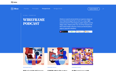
Wireframe Podcast
Check out Adobe's Wireframe podast to learn more about design.
Flip the card over to learn more.
Wireframe Podcast
Wireframe reveals the stories behind user experience design and how it helps technology fit into our lives. It’s a unique, highly produced podcast for UX/UI designers, graphic designers, and the design-curious.
Hosted by Khoi Vinh, one of Fast Company’s 100 Most Creative People in Business.
Choose your favorite podcast player to subscribe to Wireframe.
Go to Podcast
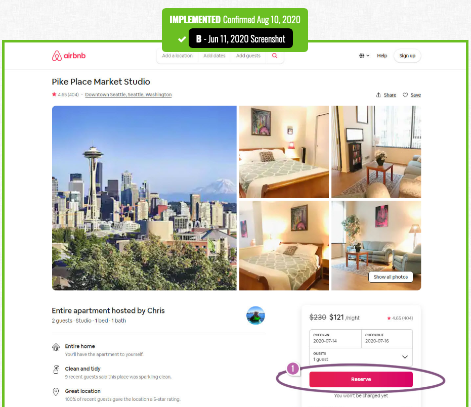
Airbnb A/B Tests And Discovers That A Higher Button Position Is Better
Airbnb ran this wonderful experiment on one of their primary reservation buttons. The A/B test adjusted the position of the button, shifting it higher on all property pages—which was implemented once ended.
Find out more about the highlighted UI changes from this leaked experiment on the back of this card.
Airbnb Tests Higher "Reserve" Button Position
Not only was a higher "Reserve" button tested on Airbnb's property listing page, but the experiment also included an underline styling for the price tool tips in the reservation card layout.
Read the interpretations of this why this experiment was the "winning" design in the article, as well as find links to previous Airbnb product leaks.
Read Full Article
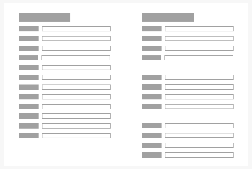
Proximity Principle in Visual Design
The principle of proximity states that items close together are likely to be perceived as part of the same group — sharing similar functionality or traits.
Learn more on the back of this card.
Proximity Principle
Gestalt principles were discovered in the first half of the 20th century by Gestalt psychologists, who were trying to make sense of how people visually perceive the world—specifically, how people decide whether certain elements are part of the same group or not.
These principles include proximity, similarity, and closure—which are all important in the visual design of digital interfaces. Later, more grouping principles (such as common region) were added to the original Gestalt list.
Read this NN/g article to learn more about why proximity is so important in UI and UX design.
Read Full Article
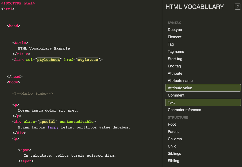
HTML Vocabulary
HTML stands for Hyper Text Markup Language. It is the standard markup language for creating webpages, as it describes the structure of a webpage. HTML consists of a series of elements which tell the browser how to display the content.
Have you ever done any HTML coding, or even heard someone speaking about HTML and wondered what the difference between a "tag" and "attribute" is?
Flip the card over to learn more about a cool site that helps you learn HTML terms.
HTML Vocabulary
Doctype... Root... Siblings... These are all words that frontend developers constantly use, but have you ever wondered what they actually mean?
Luckily, there's a site where you can click on the parts of the exampled code to see what is what. You can either click on the left side of the screen that has the code and see what that part of the code is called, or click on the terms on the right side of the screen to see how that translates to the code. This is a great way for visual learners to understand the syntax and structure of a basic HTML document.
For further clarifications about the HTML syntax and structure, you can visit the HTML5 Syntax Specification.
Visit the HTML Vocabulary Tool
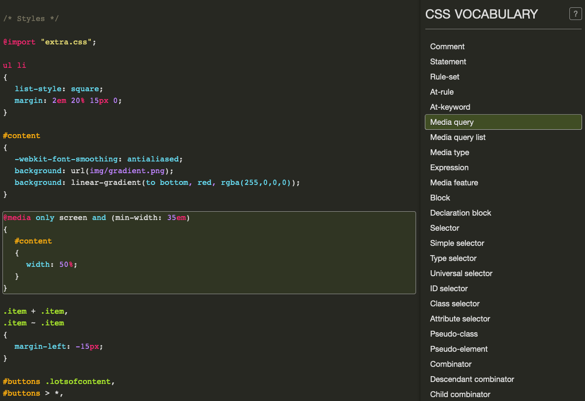
CSS Vocabulary
CSS stands for Cascading Style Sheets. CSS describes how HTML elements are to be displayed on screen, paper, or in other media.
Although HTML supports basic text formatting, CSS gives you a lot more to work with visually: page layout, typography, animation, effects, and more.
Flip the card over to learn more about a tool you can use to visually learn CSS terms.
CSS Vocabulary
CSS provides precise control over font size, color, and style. It can also position elements on a webpage, form grids for elements, and even change a page's display based on screen size (i.e., "responsive" websites).
CSS is independent of HTML and can be used with any XML-based markup language. The separation of HTML from CSS makes it easier to maintain sites, share style sheets across pages, and tailor pages to different environments.
Further, there are three different types of CSS styles—inline, external, and internal—and rules for how each of the types "cascade" over each other.
Check out the CSS Vocabulary Tool to learn some basic CSS language, such as what a media query is, an example of a CSS selector, an example of a pseudo-class, and more. Just click on the code or the terms, and you'll see how they relate!
Visit the CSS Vocabulary Tool