5-Card Friday
A Bi-Weekly Update from the ITS UX Team
Amazon Discovers That Showing Structured Product Details Is Better
Amazon has become quite the ecommerce giant over the last few years, and they are constantly A/B testing their product pages to increase conversions (i.e., revenue).
Although their product listing pages are arguably pretty "busy," they convey a ton of information to the user during the shopping (and soon to be) checkout process.
Flip the card over to learn about a leaked experiment where Amazon tested changing the location of the product details.
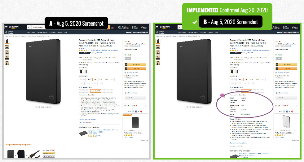
Amazon A/B Testing Location of Product Details
In previous experiments, Amazon has been seen A/B testing the addition of product details or technical specifications, visibly above the fold.
In this experiment, product details such as storage size, model numbers, and types of interfaces, were moved higher up on the product page. The display of the technical information was done with labels and short specifications.
Interestingly, this change was rolled out when the experiment finished–hinting at a positive probability.
View Experiment
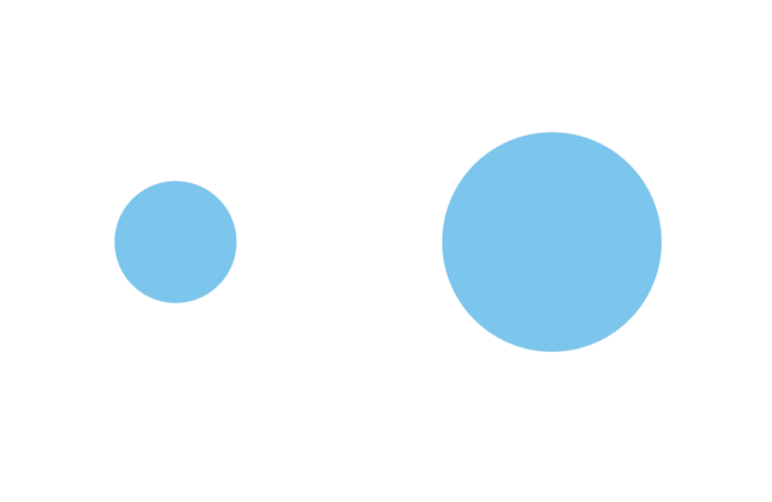
11 Ways To Add More Visual Weight to UI Object
User attention is a precious resource. When it comes to web design, every second counts. How to ensure that the visitors will see what you want them to see? How to draw attention to a particular element? The answer is simple — play with visual weight.
Flip the card over to learn more.
11 Ways To Add More Visual Weight to UI Object
What is Visual Weight?
Visual weight is a force that attracts the eye of a viewer. Every object on the page has its’ weight. The more weight an object has, the more eye is attracted to it. Visual weight allows us to create focal points (also known as points of attractions or visual magnets) — such objects have more visual weight than others.
Read Full Article
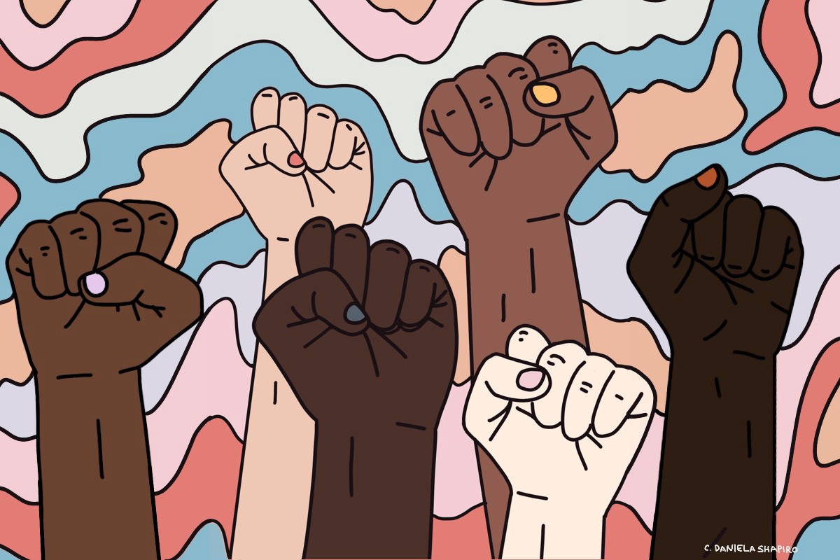
The Design Community Must Not Stay Silent
Design plays a huge role in creating the world around us. This includes the systems that continue to uphold the status quo. Racism is not a new topic, but some of us have only started paying attention this year. People are suffering and tired of the ongoing racism in this country. It’s time to be part of the solution, instead of part of the problem, and design has the power to help.
Flip the card over to read pulled quotes and understand how you can be an ally.
The Design Community Must Not Stay Silent
"As a designer, we refer to empathy, research, discovery, solutions, and success metrics in our day-to-day — but rarely is this methodology applied to the world around us. It’s evident that the structures in place don’t drive success for everyone — the Floyds, Breonnas, and Ahmauds keep happening and are a result of a broken system that’s past due for a change."
"To my design allies, the world needs you more than ever to call out systems that aren’t right and imagine what the future could be. In the design process — question who we are designing for, who we aren’t, and the systems in place that drive decision making. Through culture — question if our organizations are equipped to build something meaningful, and ideating how we can provide better ways to support and uplift our black neighbors, friends, and colleagues as we move toward that future."
Read Full Article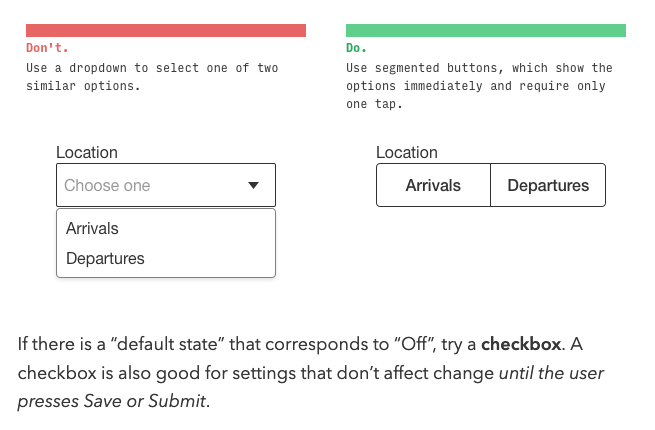
4 Rules for Intuitive UX
Every now and then, you come across an article that makes sums up UX design in a perfect way—this article on the Learn UI Design Blog does just that.
In the article, the author provides four basic rules that will improve the UX on websites and apps.
Flip the card over to learn more.
4 Rules for Intuitive UX
1. Obey the Law of Locality
All else being equal, you should put the elements in your interface near where they affect change. This is because, when a user wants to make a change to the system, they will unwittingly glance at where that change will happen.
2. ABD: Anything but Dropdowns
Any time you feel tempted to use a dropdown, ask yourself if one of the 12 controls described in the article (e.g., radio buttons, checkboxes, switches, typeahead, etc.) is better instead.
3. Pass the Squint Test
If you squint your eyes, the Most Important Thing should catch your eye first – and the least important elements should catch your eye last.
4. Teach by example
If you’re introducing users to new concepts, a few examples can be worth 1000 words –which your users wouldn’t read, anyways.
Read Full Article
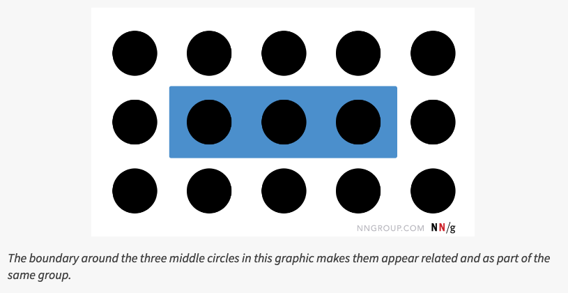
The Principle of Common Region: Containers Create Groupings
The principle of common region says that items within a boundary are perceived as a group and assumed to share some common characteristic or functionality.
Learn more on the back of this card.
Common Region
Gestalt principles guide how people visually perceive the world–including digital interfaces. Specifically, these principles explain how people decide whether several individual elements are part of the same group and, thus, are related in some way. This knowledge helps them understand and interact with the world in general, and also applies to controls and content on screens.
The original set of Gestalt principles was discovered in the first half of the twentieth century and includes proximity (which was mentioned in the 8-21-2020 issue of 5-Card Friday), similarity, and closure. Later research at the end of the twentieth century added a few more grouping principles to the list discovered initially by the Gestalt psychologists. Among these, perhaps the most relevant for UX is that of common region.
Read Full Article